Mastering Color in Lightroom using the HSL Tab
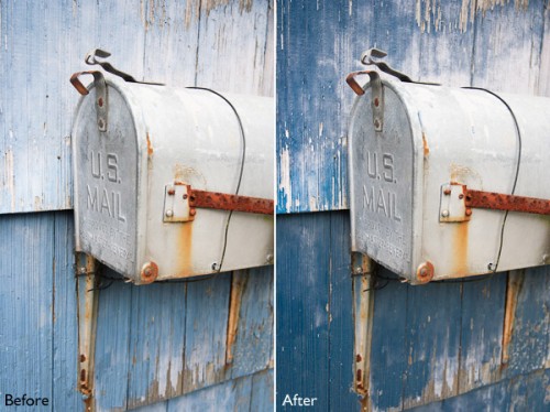
Mastering color in Lightroom occurs in two steps. The first is when you take the photo. Successful color photography requires an awareness of the colors in the scene and how they work together. If you read about the topic of color composition you will come across a lot of advice, including articles about the emotional values of color. It’s all good background knowledge, but if there’s one tip I can give that will help you compose better color images right away it is to simplify. Color is powerful, and if there are too many colors in the photo they will either clash or weaken each other. Simplify the use of color to make your images stronger. This works because the colors you choose to leave in have more impact when there are fewer other hues in the frame to distract from them.
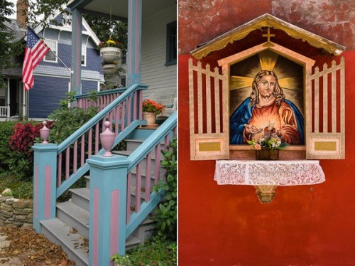
Here’s an example below. In the photo on the left the use of color is not as good as it could be. There are too many conflicting hues. The red stripes on the flag compete with the orange flowers on the porch, and the blue and violet paintwork. It is more of a snapshot than a carefully composed image.
In comparison the photo on the right is dominated by red and yellow, and the colors are much stronger.
You can go into the topic of color in more depth by reading Mitchell Kanashkevich’s ebook Captivating Color.
Color in Lightroom
The next step, after you have taken your photo, is to get the best out of it in Lightroom. Today I’m going to focus on the first two tabs in the HSL / Color / B&W panel, and show you how to use them. If you’re a Photoshop user, you will find the same sliders in Adobe Camera Raw.
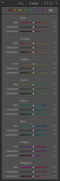
The HSL and Color tabs are essentially the same, but with the sliders arranged in a different order. In the Color tab, the sliders are grouped in eight colors.
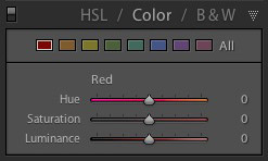
The HSL tab groups the same eight color sliders into three categories: Hue, Saturation and Luminance. It is the tab I prefer to use as I find it easier to adjust by property (ie. hue, saturation or luminance) rather than color. It also has a Targeted Adjustment Tool (I will show you how to use that further on in the article), which the Color tab doesn’t.
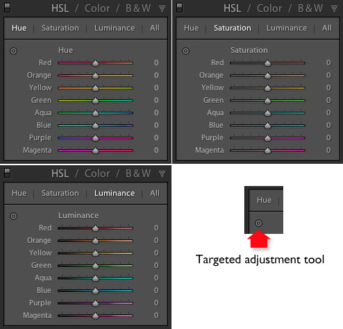
Now it’s time to take a look at the sliders under the HSL and Color tabs to see what they do. You can carry out most of these adjustments within either tab, but the examples I show you will all use the HSL tab.
Hue adjustment sliders
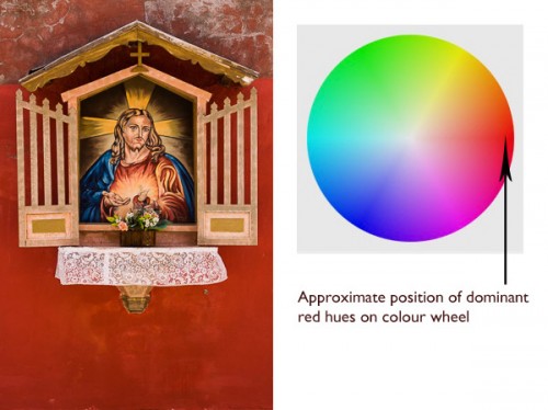
Hue is another word for color. The Hue sliders let you replace colors in your photo with neighbouring hues from the color wheel. Let’s take a look at the earlier photo again to see how it works. The image is dominated by the color red. This diagram shows you approximately where those red hues occur on the color wheel.
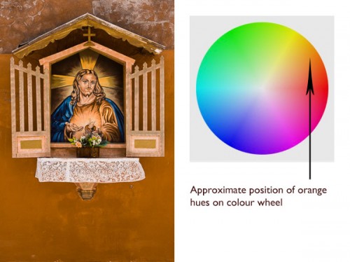
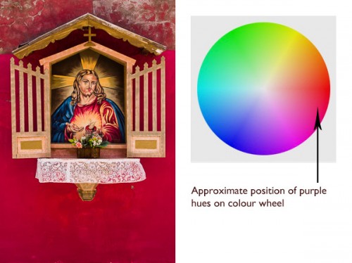
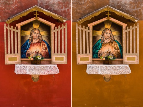
The Targeted Adjustment Tool
The Targeted Adjustment Tool gives you an alternative way to do the same thing. It is more precise than the sliders because most of the hues within your photos will fall somewhere between the color sliders in the HSL tab. The Targeted Adjustment Tool lets you target those colors exactly.
Start by clicking on the Targeted Adjustment Tool icon. Use the mouse to lay the crosshair over the hue you want to adjust. Click and hold the left mouse button down while you move the mouse upwards to replace the hues underneath the crosshair with neighbouring colors from the color wheel in one direction, and down to replace them with colors from the other direction.
When you do this, Lightroom moves colored sliders in whatever combination is required to adjust the color you have targeted. In the following example I used the Targeted Adjustment Tool to target the red colors in the wall. Lightroom moved both the Red and Orange sliders, indicating that the targeted color was comprised almost equally of those colors.
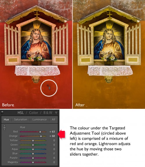
Saturation adjustment sliders
The term saturation refers to the strength of a color. If you increase Saturation, the color becomes stronger. Decrease it and it becomes weaker. Note: My article Color Composition: Using Subtle Color goes into the topic of using subtle colors in more detail.
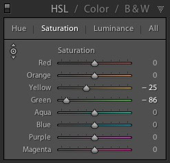
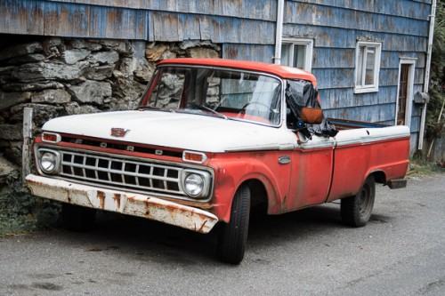
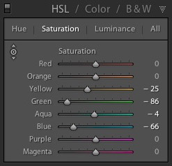
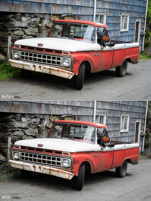
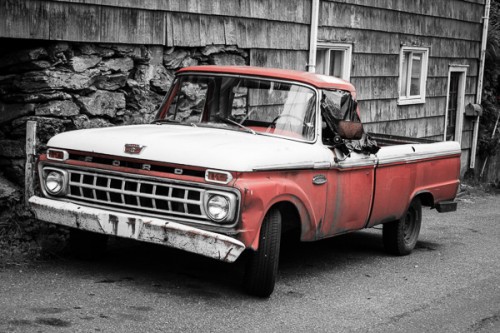
One way to emphasize color in Lightroom is to desaturate surrounding colors. Here’s an example. The starting point is an image of an old car I took in Alaska. The composition is simple – the red paintwork on the car contrasts against the blue wooden shingles on the house behind it and the patches of greenery.

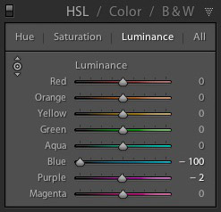
Luminance is the brightness of a color. You can make colors brighter to make them stand out more, or darker to subdue them. Depending on how bright the color was to start with, reducing luminance may also increase saturation, and increasing it may reduce saturation.
Here’s a example showing the difference when I used the Targeted Adjustment Tool to reduce the luminance of the blue paintwork.



.gif)
