How to Use the Tone Curve Panel
In this short tutorial I will show you how to use one of the easiest and most powerful tools found in Lightroom – the Tone Curve. In my previous tutorial about black & white conversions, I briefly showed you how to use the HSL Panel’s Luminance section to control the lightness of separate colors of the image. Using the Tone Curve Panel is very similar as it also allows you to control the lightness and darkness of various parts of a given photograph, however, rather than altering separate colors, the Tone Curve tool controls certain ranges of actual tones in the image.
What Is It?
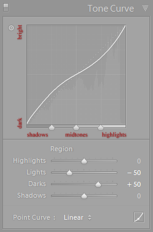
While all of this may sound very technical, it is in fact quite simple to adjust. All you need to decide on is which range of tones you want to alter, for example: if you want to make the Midtones of the image darker, just click on the middle portion of the Tone Curve and gently drag it downwards – you will notice your image getting darker as you drag it, similarly as it would if you were to decrease Exposure in the Basic Panel. If, on the other hand, you wanted to make your Shadows part of the image brighter, you should click on the left-most third of the Tone Curve which represents the Shadows and gently drag it upwards to see them brighten up. Simple, isn’t it?
Region Curve and Point Curve
Lightroom has two different Curves you can work with. The one that I’ve been showing you so far (the enlarged screenshot at the top) is the easiest to operate, especially for beginners – lets call it the Region Curve for simplicity sake. When you’re using this Curve, Lightroom basically helps you keep it as smooth in transition as possible, so that you don’t ruin your image by accidentally distorting the Curve too much. You can either adjust it by dragging the Curve itself or using the sliders bellow it, which will give you exactly the same flexibility. You can also adjust it using an automated Lighroom tool, which appears as a dot at the top left of the Tone Curve Panel, right next to the Tone Curve. All you have to do is click on it to turn the tool on and then click-and-drag on the particular tone range or area of the image to adjust it. Even if you tried hard, however, you could not make a, say, “N” shaped Curve using Region Curve simply because Lightroom is aiding you by keeping a smooth tonal transition – a very useful feature, really, it saves you from ending up with something like this:
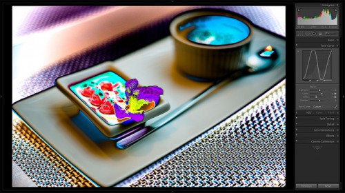
The idea of Point Curve is that you can alter it whichever way you like and make a complete mess out of your image – Lightroom will not get in your way. It’s a great tool for some advanced B&W and color work, but is also very useful when used as a starting point to work with Region Curve afterwards, much like the tone curve your camera uses when you take photographs. Lightroom actually allows you to choose one of the default settings of the Point Curve to use as a starting point – you can choose it by clicking on the drop-down list at the bottom left of the Tone Curve panel in either Region Curve or Point Curve mode.
I plan to discuss the use of the Point Curve in greater detail in future tutorials as it offers a complete new range of creative editing. For now, lets focus on the simpler and more popular Range Curve (and simply call it Tone Curve further on before it gets too confusing).
The Easy Part
As I have already mentioned, working with the Tone Curve is actually very easy. Depending on what you want to achieve, there are basically only four things you need to remember.
1) How To Make Your Image Pop
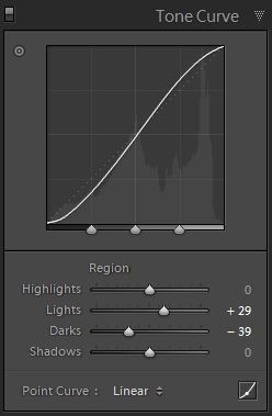
There are a few ways you can adjust the Tone Curve to give your picture that bit of magic it seems to lack initially, but by messing with it too much, you might as well end up with a horrible, unrecognizable image. The most dependable technique is adding a slight “S” curve by dragging the lower third of the curve down slightly, and the upper third of the curve slightly upwards. What this does is darken the shadows, which is the lower third of the Curve, and lightens the bright portions of the image, which are represented by the upper third of the Curve. You may just as well use the sliders under the Tone Curve to specifically change exactly what you want.
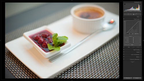

2) And If You Want Less…
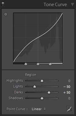
Lets see what happens if you push the upper half of the Tone Curve slightly down (Lights at -50) and the lower half of it upwards (Darks at +50):
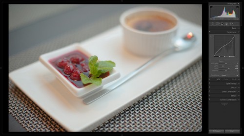
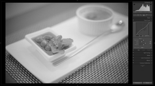
Too much is usually not a good thing, and Tone Curve adjustments follow this rule. Altering the Curve too drastically may lead to blown-out highlights and pitch-black shadows, so unless this is what you’re after, play safe and adjust the Tone Curve along with Basic Panel settings to get the best result. Remember, while it is one of the most powerful tools in Lightroom, you may end up ruining your image just as easily as enhancing it.
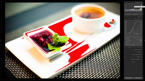
You may find that you only need to alter Lights, or Highlights, or maybe turn that straight line into a zigzag. Experiment! It’s the best way you can learn quickly and find new techniques to enhance your images on your own and then, hopefully, share them with others.



.gif)


