How to Use the Basic Panel
Lightroom has many features that can easily confuse those who are new to it. While the program offers plenty of different editing opportunities, in order to achieve the best results and user experience, it is important to understand the very basics of Lightroom. In the series of upcoming short articles, I will try to explain each of the most important Panels in Lightroom, so that in the end, you will find it to be a simple, quick and easy to use software for your post-processing needs. Lets start with the Basic Panel.
Where to Find It
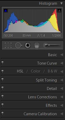
Tip – if you left-click the top of any Panel while holding down the Alt key (for Windows users) or the Option key (for Mac OS users), Lightroom will go into Solo Panel mode and only keep one Panel open at a given time (for example, if you had Tone Curve Panel open and then click on Detail Panel, the Tone Curve Panel will then close). This allows for a more tidy experience, especially if you often find yourself scrolling through the right-side Panel List. Clicking it again the same way will return Lightroom to previous state. If you want to open another panel without closing the previous one in Solo mode, Shift-click it. Ctrl(Command)-click a panel to open/close all.
The Settings
1) Treatment
The very first setting you can change in the Basic Panel is the Treatment of the image. You have two settings – “Color”, which is set by default and keeps your image in color, and “Black & White”, which, as I have mentioned in my B&W Portrait tutorial, is a great way to start working on a B&W look of your image if that is your intent.
2) White Balance
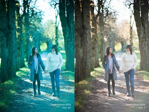
Sometimes the Auto WB setting on your camera may pick the wrong value, or you might choose a wrong one yourself. These settings are there to make sure that the color captured in your image is correct no matter how the camera was set when you took the picture, so if the image is too blue or too orange, you can easily correct it.

2.1) Temp
Here, you can either choose one of Lightroom’s presets in the drop-down menu and, if needed, tweak it further on, or simply set it to the value you think is best. Temperature tweaking is one of the most noticeable advantages offered by RAW image format over JPEG. It sets the warmth of color in your image. As you probably know, it differs greatly depending on the light source. Just move the slider until the color looks correct.
2.2) Tint
Sometimes setting correct Temperature may not be enough. Adjust this slider to the left if your image seems to have a purple tint, and to the right if it seems to have a green tint. The initial adjustment depends on what the camera was set to when the image was taken.
Tip – us the “Auto” feature to let Lightroom decide what Tone settings fit that particular photograph. While it might make a mess of things, sometimes you can find a good starting point in Lightroom’s automatic features that will only need a modest amount of tweaking.
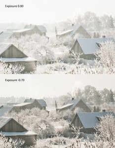
3.1) Exposure
3.2) Contrast
Adjusting this setting will either make your image have more or less contrast. Move the slider to the left to make bright parts of the image less bright and dark parts less dark, or move it to the right to make shadows and highlights more distinguishable. This slider is good for making minor changes, but overall doesn’t offer much control over which tones should be considered as bright or dark. The Tone Curve is much better for that, but it’s also slightly more complicated.
3.3) Highlights, Shadows, Whites and Blacks
These tools are among the most powerful in Lightroom 4 and are real life savers, they let you individually adjust the dark and light parts of the image. If you find that, even after using the Exposure Compensation slider, some parts of your image don’t look good enough, use the Highlights and Whites sliders to bring back some of the seemingly blown out areas in the image, or Shadows and Blacks sliders to fill in those dark portions of the photograph and give the it more detail. With that in mind, you can also move the sliders to the other side to make the light parts of the image even lighter, or dark and shadowy parts darker. To make the light or dark parts darker, move the sliders to the left, and to make them lighter, move them to the right.
Tip – these tools work well in combination with the Contrast slider or, especially, the Tone Curve tool – they allow you to keep the image nice and contrasty while, at the same time, keeping those highlights and shadows at bay. These sliders don’t affect the mid-tones much, so your overall exposition will remain correct – just set it the way you like and then adjust the parts of the image that are either too bright or too dark to get exactly the look you want.
4) Presence
4.1) Clarity
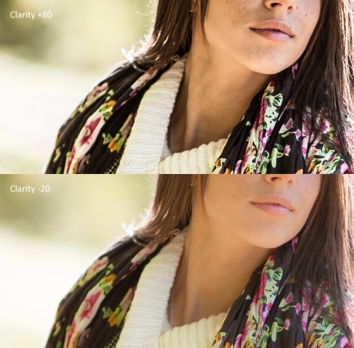
4.2) Vibrance
If you want the colors in your image to be more saturated, this is the setting you change. Now, while I said “saturated”, the correct term would be “vibrant”. This slider, if moved to the right, will make the colors more intense, but only where needed – it will not shift them or give a color cast to the image. If you move it to the left, the colors will be much less intense, but the photograph won’t go completely black & white.
4.3) Saturation
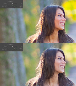
Differences In Lightroom 3
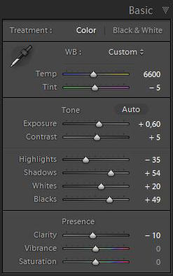
The Limitations of the JPEG Image Format
You will find that all the functions found in the Basic Panel will do their job when editing JPEGs, however they will have much less latitude (the Exposure slider, mostly) and will be much more intense. If you had a small error in your WB settings, for example, Lightroom might help you fix it, but only if it’s not too critical. With a more extreme adjustment, you will find your image losing quality rather quickly, simply because JPEGs limits the amount of information stored in the image, specifically color, shadows and highlights. Edit those JPEGs with care.


.gif)
