How to Enhance Landscape Photos
So, you’ve taken a photograph of a beautiful sunset or a peaceful, fog-covered valley. But something is missing in the picture – it just doesn’t look as good straight out of camera as the scene you were seeing at the time. By using simple Lightroom tools, such as Clarity, Graduated Filter and Curves, enhancing a landscape can be a very simple and fast process. While there are many advanced ways of processing landscapes, not all images require that much post-processing. In this Mastering Lightroom series article, I will show you how to quickly enhance landscape photographs using just Lightroom 4.
1) The Photograph
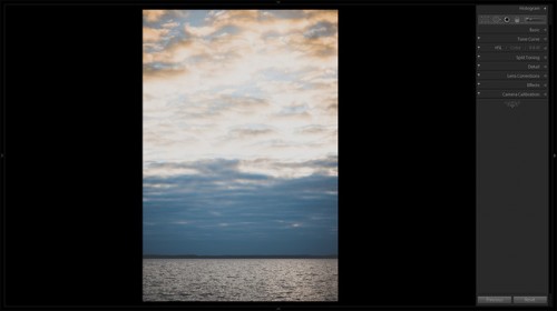
I took this image on a beautiful evening by a lake nearby. The sky had a very subtle yellow cast to it due to sun coming down. There was some gentle wind, so the lake surface was covered in small, nervous waves – it looked almost as if the water was on the verge of boiling. It also looked somehow solid – you couldn’t really see through it at all. Not a very dramatic sight, it was peaceful. I also liked the contrast between warm color of the sky and the cool color of the lake surface.
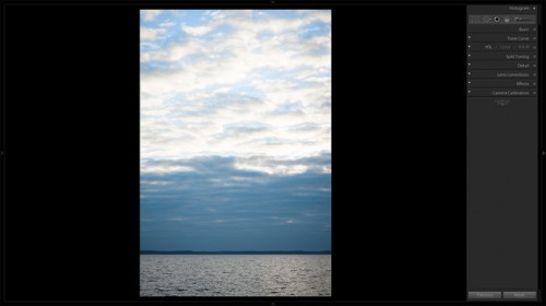
Unfortunately, though, flat RAW capture often means that the image will need some adjustments before it is close to what you actually see. Caught up in the moment, I didn’t bother with correct WB settings as I knew I’d need to work with color and contrast within Lightroom. My D700 failed to record subtle yellows of the sky and the contrast of the lake surface glimmering in the sun, or at least they didn’t show up in its unedited NEF image. Here is the RAW right after I imported it into Lightroom 4 – compare it with the final image above:
2) Enhancing Landscapes
There is a thin line between an attractively enhanced image and a ruined one. Too much contrast and saturation can often lead to less-than-tasteful results and it is crucial to know when to stop. I will now list basic settings you can adjust when post-processing landscape images. I will also show you what adjustments I made to get the image you see at the top of this article. I chose to enhance this image fairly subtly. What I wanted to do was bring back some of the yellow cast in those soft clouds and intensify sea surface creating a strong emotional contrast between the two subjects. Here are the steps I took to enhance the photograph:
Straighten the Horizon – Tilted horizon (a typical result of bad framing) may not seem like such a big deal, but it can easily ruin your landscape. Fortunately, leveling it is a very simple process within Lightroom 4. To do that, you need to use Straighten Tool, which you can find in Crop Overlay tool-set. Activate the tool-set by hitting R on your keyboard. Then, choose Straighten Tool and draw a guide over a line in the image which is supposed to be level – in my case, it’s the horizon. Done! Alternatively, you can rotate the image on your own by moving your cursor outside image border. A rotation cursor will appear – click and drag to rotate the image.
This the first step I usually take when post-processing those few landscapes I do. I felt I made the right choice composition-wise, but there was a slight tilt in the horizon which I chose to fix using Straighten Tool within Crop Overlay tool-set.
Fix Distortion – Distortion can be as distracting as a tilted horizon. It is very important that you remove any distortion present in your landscape image. I chose to fix it so that I had a very defined, straight horizon (a sort of border line between soft clouds and chaotic waves on the water surface). It only takes a couple of mouse clicks. All you have to do is go to Lens Correction tab and check “Enable Profile Corrections”. Once you do that, if your lens is recognized by the software, it will automatically correct all distortion issues. If nothing happens and your lens is not supported, you can manually fix distortion by moving the distortion slider.
Remove Sensor Dust – in many photographs, sensor dust, if present, is not easily noticeable. This is usually not the case with landscapes that feature a lot of smooth tone areas, such as the sky. I used the Spot Removal tool to quickly get rid of any dust spots. These dust spots were more apparent than usual because of narrow aperture of f/11 used to capture the image. Read my “How to Use the Spot Removal Tool” tutorial if you’ve never used it before.
Detail Tab – generally, sharpness is an important aspect of a good landscape image. Even when shot at optimal apertures, using clever sharpness settings will make it that much better. To adjust sharpening, go to Detail tab. I set sharpness at 80 with a radius of 0,8 pixels and Luminance noise reduction at 20. It may seem a lot for a D700 image taken at a mere ISO 320 and I’m usually not one to worry about noise, but this time I wanted pixel-level smoothness. If you want to see a much more detailed guide on sharpening, see Nasim’s Sharpening in Lightroom article.
Adjust White Balance – Color and tones are of extreme importance in landscape photography, so it’s important to set White Balance at a most suitable value. Generally, I tend to set it to a slightly warmer setting than the default value. In the case of the above landscape, camera-captured colors were a little too cool. I moved the Temp slider to 4800. Such a small change didn’t really bring back the yellows of the sky, but it did add a little warmth to the scene – after all, it was evening light. I also moved Tint slider from -7 to -4 feeling that my D700 tried a bit too much to counter magenta cast. A small, yet noticeable adjustment, it seemed to add to the scene.
Increase Clarity – this adjustment was necessary to intensify micro-contrast and give a more defined look to texture of the sea and sky. I set the Clarity slider to +20 for this image.
A side note: if you want to learn more about the effect of White Balance, Clarity and other settings found in the Basic Panel, read my “How to Use the Basic Panel” tutorial.
Lets see where these 6 steps took us:
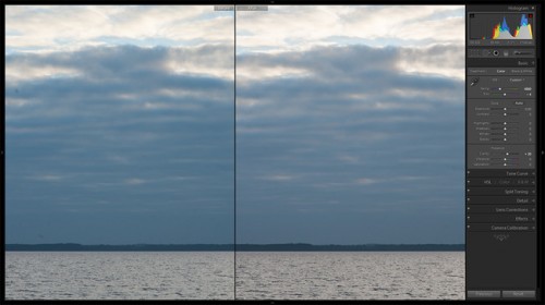
Graduated Filter – this is a very powerful tool within Lightroom environment. Essentially, Graduated Filter allows you to selectively post-process parts of an image and adjust all kinds of settings, such as Exposure, White Balance, basic Sharpness, Clarity and so on. I will discuss this vastly capable tool in much more detail in upcoming tutorial. For now, I only need to adjust a few settings with two separate Filters. In order to apply Graduated Filter, click and drag anywhere on the photograph to define where you want it to affect your image. Best way to see how it works is to set extreme settings first (Contrast and Clarity to +100, for example) which you can then tune down.
I will use the first filter on the sky. What I want to do is bring down those highlights a little. After some trial and error I set the Exposure slider to -0,43. I then increased Contrast to +10 and recovered highlights by moving corresponding slider to -10. Another step was to add a little bit more Clarity, so I set the slider to +10. I want those clouds to be well-defined, but not too much in comparison to water surface. With the second filter, I will add more Clarity there. The last step with this filter, however, is what’s going to bring us those subtle yellows. At the very bottom of Graduated Filter tab, there is a setting called Color. Using this setting you can add color tint to an area affected by that filter. I need subtle, warm yellow cast, so I set H (Hue) to 42 and S (Saturation) to 68% careful not to overdo.
The second filter is for the water. With this filter, I increased Contrast to 24 and Clarity to 20. Both settings made the waves a little bit more noticeable at the edges where it’s closer to the viewer.
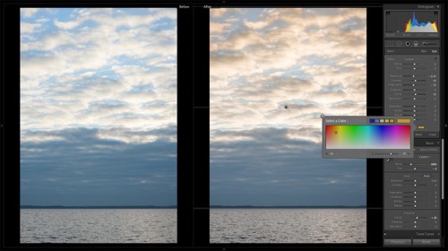
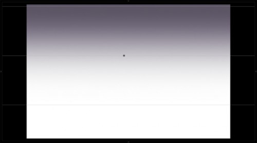
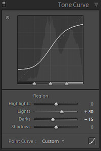
Add Vignetting – not always a good thing to do, Vignetting may sometimes add greatly to an image. By subtly darkening the corners, you will guide the viewer’s eye towards the center of your photograph. For this reason, I don’t always choose to remove natural lens vignetting in the Lens Correction tab, and sometimes even add a little on top. To do that, click the Effects tab. There, set the amount of vignetting you want Lightroom to apply. Once you’ve done that you will have access to other vignetting settings. Use them to make it look more natural.
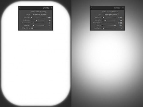
I will talk about vignetting settings in more detail in upcoming tutorial. For now, let’s just use Highlight Priority post-crop vignetting style. Here are the settings I used for my image: Amount -14, Midpoint 27, Roundness +38, Feather 83, Highlights 0. It made for a slight, natural-looking corner shading, which is what I was aiming for.
That’s about it for me when quickly post-processing my landscape images.
3) You Are in Control
While I chose to enhance my image gently, your taste will vary. Changing all these settings more drastically will result in a more dramatic image, and depending on the scene and mood you want to capture, might be a good decision. Play with them, experiment to find what fits best that particular landscape you’re working on. With enough practice, you will learn to achieve a desired result very quickly. If you’ve got several particular looks as favorites, you may also save them as presets, which will help you spend even less time post-processing.


.gif)


