Composing Dynamic Landscape Images
As a landscape photographer I am constantly seeking that next X-factor shot – an image that leaps from the screen or page and demands the viewer’s attention – preferably attention of the favourable variety.
If you spend an hour or two on a photosharing site like Flickr viewing landscape images in un- curated groups you will note that a very small percentage of the total image population stands out from the crowd.
However, if you view a carefully curated collection of top-shelf landscape images you will probably start to notice some themes appearing. Certain visual cues and devices appear across multiple images – there will often be subtle commonalities between these attention hogging photos.
In many instances these images will possess the qualities of what I consider a dynamic landscape image.
What is a Dynamic Landscape Image?
There is no dictionary entry that defines a Dynamic Landscape Image* – heck, there’s not even a Wikipedia entry – so it is a somewhat personal interpretation.
To my mind, a dynamic landscape image is one that in some way conveys the energy and scale of the natural world. Dynamic images also often seek to breach the confines of their 2D medium by inferring a sense of depth – many truly dynamic image have an almost 3D quality about them.
*As far as I am aware, the term Dynamic Landscape was first popularised by the late Galen Rowell – one of the most influential American landscape photographers of his generation. Rowell used the term to demarcate his work from the somewhat literal colour landscape photography that dominated the early 1970′s. Although he was certainly not the only photographer employing these principles in his work, he appears to have been an excellent self-promoter and the term is somewhat synonymous with his name.
Dynamic Composition
Composition is the backbone of all great photos – dynamic or otherwise – but it is essential in the creation of a truly strong landscape image.
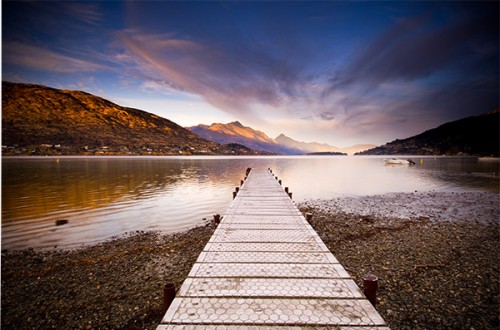
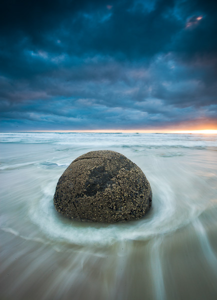
I feel that the goal of a successful composition is to draw the eye into image and hold it there for as long as possible – which is seemingly, a maximum 15 milliseconds these days*. The following image is an example of an image that I feel achieves this objective.
This image combines all of the elements that I feel comprise a Dynamic Landscape Image:
- Leading or converging lines
- Interesting perspective
- Visually interesting foreground elements
- Visually interesting mid-ground & background elements
- Vivid colour or incredible light
- Vision-locking tonal control
- Suggestion of movement
It is important to note that not all dynamic landscape images possess all of these factors. In fact, it is depressingly rare to have it all come together in one moment. It must also be stated that what follows is not a recipe for creating great images. Photography can only be practised as an art when personal interpretation is injected into the process – only use this information as a guideline for evolving your own images.
So let’s have a very quick look at each of these Dynamic Landscape factors.
Leading Lines & Converging Lines
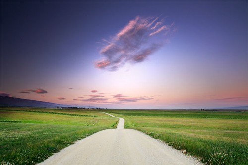
One of the simplest ways to draw a viewer’s attention into an image is to use converging or leading lines. Converging lines have been used by painters for centuries to create the illusion of depth within a 2 dimensional medium.
This is why photos of wharves, roads, and rivers make such successful photographic subjects. Although many consider such subjects to be cliches, I strongly council my workshop students to shoot them heavily to build an awareness of the power of a line in an image.
Leading lines not only draw attention into the image, they can also help to hold the eye within the confines of the image.
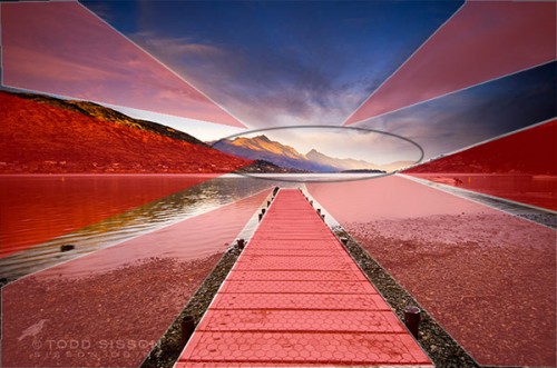
Check out the crudely overlaid wharf image below combines the strong converging lines of the wharf with secondary supporting lines in the water, hills and clouds.
Look for these lines whenever you are shooting – they are almost everywhere.
Interesting Perspective
As a photographer you are an artist not a forensic documentarian. You get paid the mega-bucks and live the champagne lifestyle to show your audience something a little different – that is your raison d’être.
Hence I rarely find myself shooting at my natural standing position. For some reason, compositions seem to get more dynamic the closer you are to the ground/mud/ snow/ice-encrusted cow turd – it’s just the way it is.
This is especially apparent when using an ultra-wide lens. Subject matter becomes incredibly diminutive and interesting leading lines really lose their visual power when viewed from 5 or 6 feet high – so try getting uncomfortably close and low.
Aim high also. Look for ways to gain elevation to find that privileged viewpoint – I find that this often works really well when shooting telephoto lengths for some reason. Try scrambling up banks, standing on cars and sitting on your wife’s/husband’s shoulders (sans tripod) in an effort to find an interesting perspective.
Foreground Elements
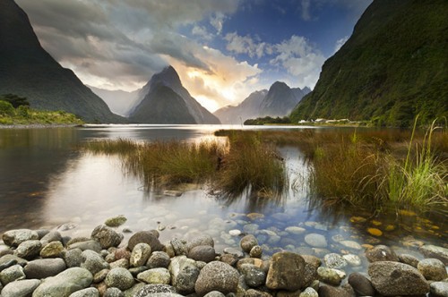
I believe that a dynamic image almost always possesses a strong foreground element, or elements, that complement the greater scene.
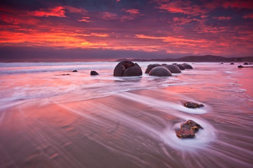
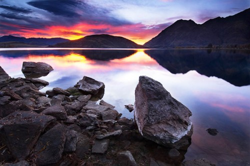
Take a sunset/sunrise for example. Sure, spectacular light makes for great images, but personally photos that contain nothing but vast expanses of super-saucy red clouds do little to engage me as a viewer.
The best dynamic images typically have a strong point of interest in the lower half, or foreground. This is your visual entree into an image. If your foreground element happens to include leading lines you are quite possibly onto the much vaunted money-shot.
Visually interesting Background Elements
I often compose back to front. Firstly I will find the subject of my image, say a spectacular sunset playing out on mountains, and then I will run around like a deranged prison escapee in search of a foreground element to complement the background.
It is very much a balancing act – defining who or what element gets to play the lead role in your composition. Ideally the background is where the eye should gravitate to and the foreground should pick up a gong for best supporting actor.
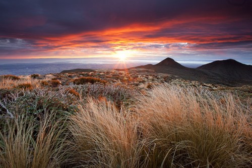
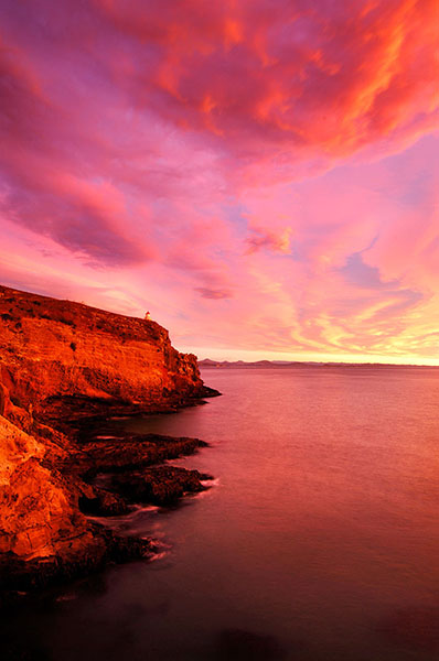
Unusually, I didn’t scramble to find a foreground element for this image – I staggered. Four minutes earlier I had been happily sleeping in the back of my truck – my alarm went off and I saw this – panic ensued….
Vivid Colour or Incredible Light
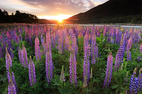
By now it should be obvious that I have some un-checked colour-dependancy issues. I love colour*, especially natural light shows. However, I feel that vivid colour needs to be kept in balance and be a part of the overall composition. Too often I see images that rely solely upon dollops of super- saturated colour.
For a dynamic landscape image to work, balance must prevail. Hence I attempt to avoid filling the frame with too much colour (yes, there is such a thing – see below).
*I am even partial to the American version – colour.
Vision-locking Tonal Control
I am tempted to trademark this term – it sounds like a mind-control experiment deployed by shady branches of the US intelligence community.
Basically all I am referring to is the phenomenon of vignetting.
The eye is drawn towards lightness within an image, particularly near the centre of frame. Furthermore, the eye is restrained by darkness at the edges of the frame.
When employed deftly, the viewer’s eye is gently drawn into the image by lightness and held there by the darker edges of the image.
Suggested Motion
Suggested motion, by way of blur or frozen motion is not always an achievable, or desirable, element to utilise within an image – but it can add another layer of dynamism to a composition.
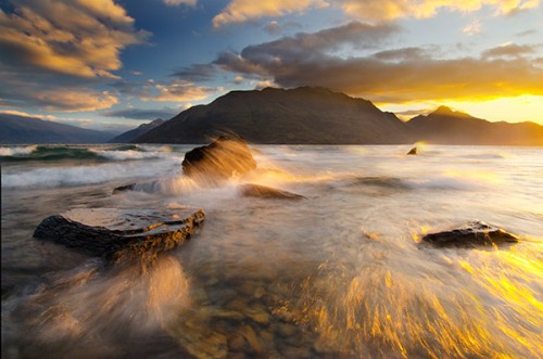
Don’t just get locked into shooting long exposures either – frozen, or partially-frozen motion can convey movement just as well as a long exposure in some circumstances (see the first image, Summer Storm, for an example of this).
Can Dynamic Landscape Images be B&W?
Absolutely. There are many thousands of truly incredible B&W dynamic landscape images. No style renders texture and contrast better than B&W – at it’s best it is magnificent.
In order to compensate for their ‘lost’ colour Black & Whiters will often apply industrial grade quantities of Vision Locking Tonal Control (that’s why vignette sliders to go -100) and rely heavily upon strong graphical elements such as leading lines (you will find a lot of B&W photos of wharves and sewerage pipes heading out to sea).
I would show you an example of this, but I am mono-challenged. If you want to see B&W Dynamic landscapes at their best check out the work of Mitch Dobrowner & Hengki Koentjoro.
So Are All Good Landscape Images ‘Dynamic’?
Not at all. Stunning images can be made by avoiding almost all of the techniques that I have just espoused in this essay. Dynamic Landscape composition is just one style of landscape photography.
In fact, many of my favourite images by others are beautifully composed static, flat compositions. These ‘static’ images respectfully comply with the two dimensional constraints of the photographic medium and rely upon a separate set of visual devices in order to ‘succeed’.


.gif)


